Public Speaking
Death by PowerPoint appears frequently as a criticism by skilled communicators. Some hate using the medium, and of course, many more love PowerPoint. Of course it is not the only medium for creating visual material. There is Keynote, Prezi, Visme, Haiku Duck and Emaze. But, if you find the right one sticking to it brings confidence and familiarity. For those of us who love Microsoft, PowerPoint makes sense. This article is for all readers not just professionals and is applicable to all speaker sessions whether socially or in business.
Why is PowerPoint hated?
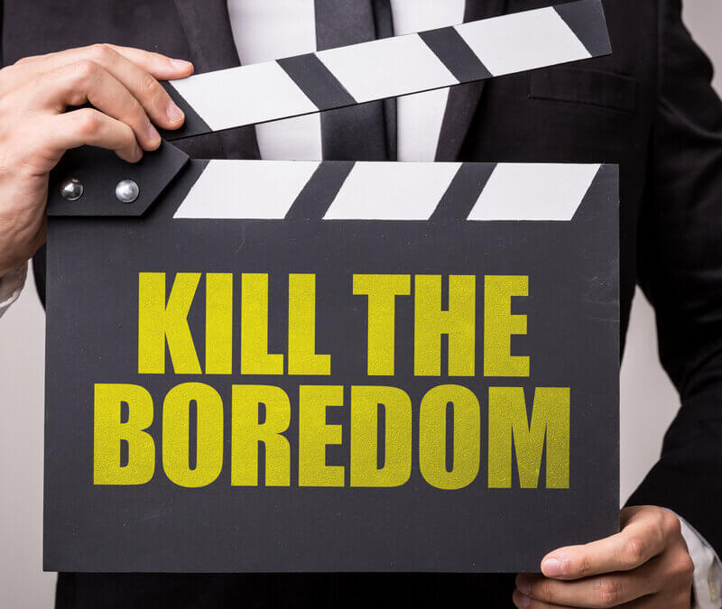
Well, it is simple. Good speakers feel that PowerPoint makes people lazy, leading to a lack of being prepared. I thought it was a good topic as conference season is starting to warm up for some. Preparation is everything and of course, your talk looks better for those slides. I am a strong proponent of PowerPoint, but I have to say it is poorly used more than it is used well. In preparing this short article I have adopted the term Death by PowerPoint because it really can kill what could be a good talk. A few tips might not go amiss.
good PowerPoint planning adds confidence to the speaker
Why do I speak?
To entertain, engage, educate, and help me promote my message. I need an engaged audience, and I want to ensure that my audience stays alert. Slides are visual and used intelligently, with the spoken word bringing life to a talk.
Five Tips
Have you ever sat in a talk where each slide is filled with writing or where the image is packed with too many illustrations? Here are five tips to improve and achieve a better result. Some of these tips form golden rules; others are based on recommendations passed down by experienced speakers.
1. Your slide presentation is not your talk or lecture; you are. Know your content if the slide programme went down accidentally.
For many writing details onto a slide is a false idea of value. It may help the speaker who proceed to read his or her slide but sends the audience to sleep. This is an absolute don’t go there rule
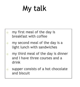
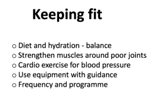
Oops, that’s a scary thought. I need my slides, so I know where I am! No problem. Make up some cards so that you have aid. This will keep order but make the cards brief. You can also place notes under the slide when planning. The audience won’t see these no matter how detailed they are. The talk looks different now as the speaker is breaking the content into 3 clear sections and can develop each separately. The audience knows where he or she is heading – the talk is about diet and quality food and drink.
Next – how many words and sentences can I use?
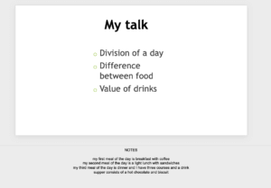
the same notes on the first slide are under the slide
2. Writing on a slide should ideally be minimal. The rule of FIVE. Five maximum words per line and FIVE maximum lines per slide. i.e. 25 tops.
- title slide is not always required. Rule of FIVE. Even in this example the words could be pruned down to 1-3 words per line
-
-
-
-
-
-
-
-
-
- Balance of diet
- Muscles & joints
- Cardio exercise
- Equipment
- Timetable
-
-
-
-
-
-
-
-
The eye cannot take on more information than this. Therefore, do not use your slide as your talk. Instead, use the animation option to bring one line down at a time if you must use more. The audience will always read the slide, take their eye off you, and stop listening momentarily.
3. Use no more illustrations than necessary. The ideal is a single picture that fills the screen in a high-quality format. Avoid transitions – those attributes that make the picture move. Instead, keep the picture simple to help visibility and stop the audience from becoming distracted. If you use transitions, try to use the same style.
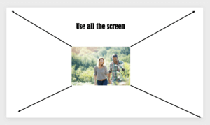
use quality photos but make them large – single pictures are best
All illustrations need to have value, enhance the talk and ideally should support your words and, in some cases, replace words.
Remember, “a picture is worth a thousand words!”
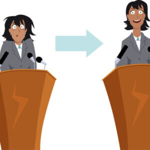
4. Never read from your slides. You should know them backwards and help your audience engage with your words. Your voice is essential, which must be used to engage your audience. Every time you look away from the audience your voice (sound) diminishes or, worse, becomes lost. Talk naturally and learn the order rather than the words.
Practice – practice – practice; your talk will look more professional
But I need to read the slides as I don’t remember my talk. Modern conferences have a console screen so you can look down rather than toward the screen. PowerPoint offers the next screen view as well, plus you can put notes down at the bottom of your slide so no one but you will see these.
5. I have a 20-minute slot, so 20 slides should be fine?
Don’t confuse the number of slides with quality. Less is more, as they say. You could have 50 slides for a 20-minute slot if you were experienced and wanted to make a movie. Time your talk three times and check if one or more slides will push you over your time. Remove anything that is extraneous and of little value. Keep slides that offer the best value, i.e. allows visual understanding of a complex concept, gets the message across succinctly.
I am asked, should I prepare my slides before my talk? To be honest, this must be left to experience and personal preference. As we sometimes call the slides, a slide programme or slide deck can help design a talk but must never be the talk.
Flesh out the title – the introduction – main content – conclusion. Make sure it flows and connects. Keep the subject to one central theme and perhaps up to 3 sub-themes as a guide. Remove any slide that slows or lengthens the talk. Above all, keep to time.
Good luck with your presentation, be it 10 minutes or longer. Shorter talks are often the most difficult to design and deliver, while 25-30 minute talks are perfect. Longer speeches can turn the audience ‘off ‘unless the talk is vital to information needs, i.e. examination preparation. Our aim should be to keep alive our audience with PowerPoint, not make them want to curl up and feel like ‘death’ if one more heavily packed slide is shown!
Talks, lectures, speeches and peroration
TED talk
TED stands for technology, entertainment and design and came about in 1987 by Richard Wurman in the USA. There are books on TED talks and TED slides and they pretty much follow some of the five tips above. The fundamentals of TED explained. The timing of the TED talk is critical and usually one theme and one message. I use Greta Thunberg as an example of delivering a simple message to a worldwide audience. Whether you like her and her theme does not matter. Admire her for the presentation. There is a trend emerging where conferences include key note speakers as well as a group of short talks. Many people asked to submit do so with a strict time limit of 10 minutes. This is pretty short and takes longer to prepare than a 25 minute talk! How so? Well, timing is critical and that message must be clear and unburdened with any side plots or discussion. Let’s say you want to tell a funny joke or anecdote. You must be pretty sure that it fits, it is relevant and does not move the audience from the theme. Shorter talks in my view are pointless at a conference but they can still be used intelligently if necessary. Another trend has been to limit slides. The rationale is to stop Death by PowerPoint!
After dinner speeches are a whole new ball game as much as giving a lecture or lesson to students. The greater the interaction the more you need to know about your audience. As practical elements come into play, time soon ebbs away and so seminars or workshops become another part of the rainbow of methods to communicate to people.
If you have enjoyed this short article and have found it helpful, please read my books on ‘public speaking’ and ‘PowerPoint design’. I take you from conference hall to village hall complete with anecdotes, dos and don’ts, crazy speakers and good speakers.
Reflection
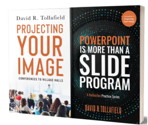
I have probably made every mistake in the book! I was never formally taught how to speak and when starting out PowerPoint or electronic systems were not available. Just before the 2019 pandemic I worked on 2 books so I could compress all my own ideas and experience; good and bad, into a book. How to project your image through talking takes the inexperienced novice through the process. The second book covers PowerPoint is detail to allow anyone to navigate how to work the system for the best. I never stop learning and love to embrace new technology, but equally I love to share my own experience. I hope you gain value from these two books available from Amazon. (.com and .co.uk)
The PowerPoint book – ‘PowerPoint is more than a slide program’ is not available as an ebook because I felt as a reader this worked better as a reference. Both books have Indexes at the back for easier navigation. As I say at Busypencilcase Communications – Progress is through the art of communication.
There’s heaps more tips and information for those who wish to better themselves in these illustrated books.

David is a foot health journalist, author, educationalist and public speaker. He spent forty years as a professional health care worker and teacher. He reaches out to all who are interested in health and feet as well as writing, and happy to communicate with people and share their stories. You can write to him at busypencilcasecfp@gmail.com. He publishes a regular newsfeed available free to all. Why not sign up to his mailing list today? Link
Thanks for reading ‘Death by PowerPoint’ by David R Tollafield
Published by Busypencilcase Communications. Est. 2015
![]()
1st February 2022
Recent Comments